Blog Post
Designing and the process #2
September 09, 2015
As I mentioned in Part #1, I first consider content and then look for design inspiration. Layout is typically where I sometimes struggle for print, honestly. I don't like adding content for the sake of filling space and I want the layout to help with the hierarchy of content.
Design - Cover
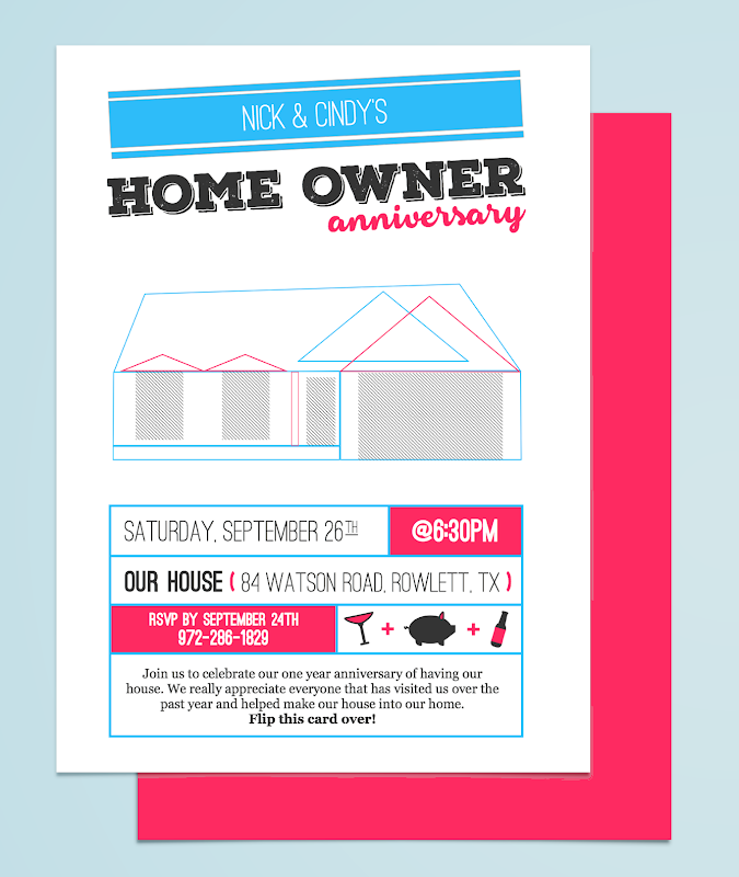
For example, I looked around at different infographics. I've seen plenty of them and the items are often in their own space. I opened up Sketch, set the size, and began adding elements. My first graphic to create was the main one on the front - a house built with just rectangles (very minimalistic.) A banner for the heading felt appropriate - it makes me think "festive announcement." Once I had the text done, I began to create the custom icons. I already knew what would be served: margaritas, beer, and pork. Those three things have some very recognizable graphics to represent them, luckily. Sketch allows you to make them into reusable symbols which is perfect.
(Yeah, I got lazy with the naming...)
Once the icons were made, and I finished the cover, I was inspired for the back part of the invitation. Clean, thin lines for borders. Continued use of the theme colors for the rest of the icons. Lovely.
Design - Back
In order to continue on with simple, thin-bordered rectangles, I decided to use them to divide the content for the back. I used a serif font for descriptive text which I barely used since most of them did not need descriptions. The sans-serif font was used for the information itself and the numbers were made a bit heavier that the regular text. The decorative font was really just used for the word "anniversary" for the cover but I found another use for it: our names. It didn't make sense for either the sans-serif and serif fonts to be used for our names so using the display text was more of a "let's see if this works" approach. Glad it worked out.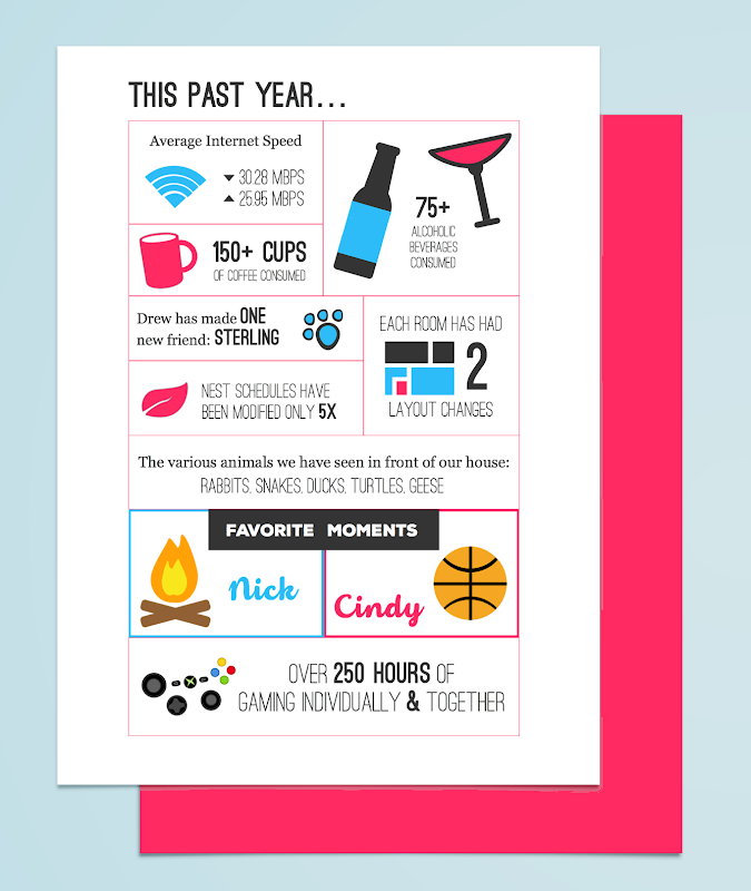
This is part two of a two part entry.