Blog Post
Designing and the process #1
For most of this year, I have been focused on improving my technical skills. No complaints; I love building single page applications. On the other hand, there have been times where I reach for a pencil and start to sketch.
My first job ever was a development/design position with a much greater emphasis on designing for print: flyers, posters, shirts, etc. I never thought much about my process or workflow, though. I would receive an assignment - often a poster for an event - and look at previous designs for the same event since most of the events were annual. Some would be pretty basic such as one graphic, a patterned background, and the necessary text. Others would have incredible details such as vector graphics and custom typography. I enjoyed looking through the variety as it was a student position so turnover was quick which left a range of previous work. Looking for inspiration? Well, upon reflection, I suppose I was looking for direction and would take my own lead from there.
Now, though, I don't do as much designing as I used to. Sure, I contribute to design like I did at Joinem... but more often than not, I stick to consulting by choice. I respect designers and their ability to create beautiful things from nothing. At Joinem, I felt like more of a lighthouse since we had various people touching the designs with no styleguide. I highly discourage that, by the way. There is such a thing as too many cooks in a kitchen and sometimes they aren't all cooks.
I felt compelled to create a dynamic styleguide for the team after a couple months of receiving a bunch of different font sizes and styles from freelance designers but rarely had the time to add to it. I was focused on the client-side code; so, there you have it, an important aspect of a website was a frontend developers' side-project that was on the back-burner. How unfortunate. No, I don't think that a styleguide would have solved all of our problems. It could have prevented a substantial amount and saved so much time/efforts, though.
Anyway, these days, I have the time to reengage with my creative side. A year ago, I bought a house with my boyfriend. A few months into it, I bought these blank cardboard-looking cards that I thought would be nice to design on. Eventually, I found a great use for them: invitations! They were a good 3.5 x 5.5 inches but figured I could make it work.
Inspiration
Since these are invitations for my own events, I first write down the information that is needed such as location, time, date, etc. Then, I use that to begin the layout. The cards are relatively small so I aim to make the best use of the space. Luckily, they're double sided so really one side can have all the needed information and the other side can be the "fun" part for me. Once I have the layout, I continue on with the other aspects of the design.I am incredibly picky about colors. These cards were a bit limiting in a way because they are quite dark. It kind of narrowed the scope for color. So, I started by visiting dribbble and looking at color palettes that had been used with brown (the color of the cards). I generally had a theme in my mind for the event itself but I had to determine if it needed to be lightened or darkened to look good on the card itself. A dark gray is always a beautiful color for text and it'd be pretty powerful on a brownish background so I chose it for my main text color. Light shades of red and blue worked well for large text (titles) and graphics.
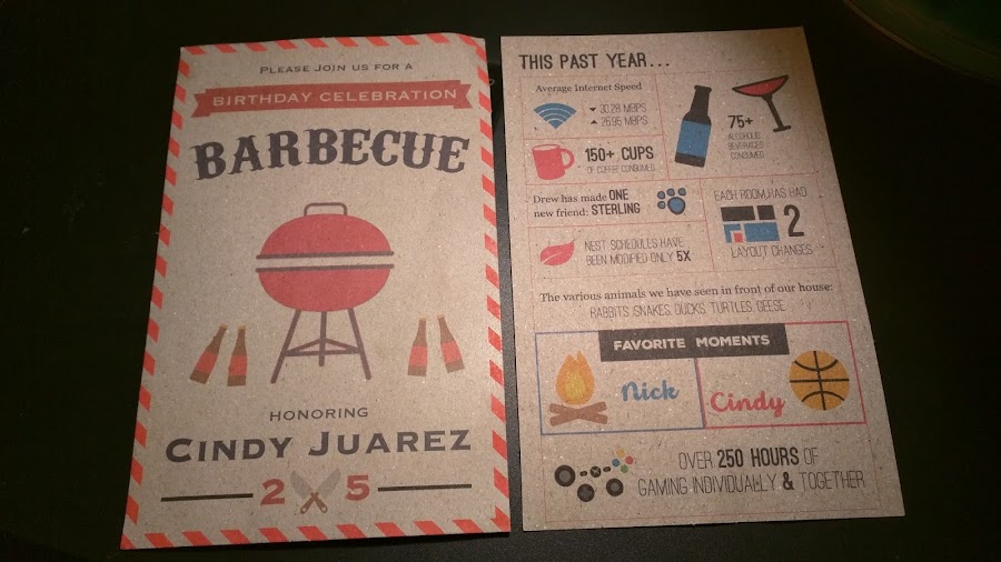
The one on the left is the front of a birthday BBQ card and the one on the right is the back of the house anniversary card.